

Rival Brand Training Mixed Media 2—28
DESCRIPTION:
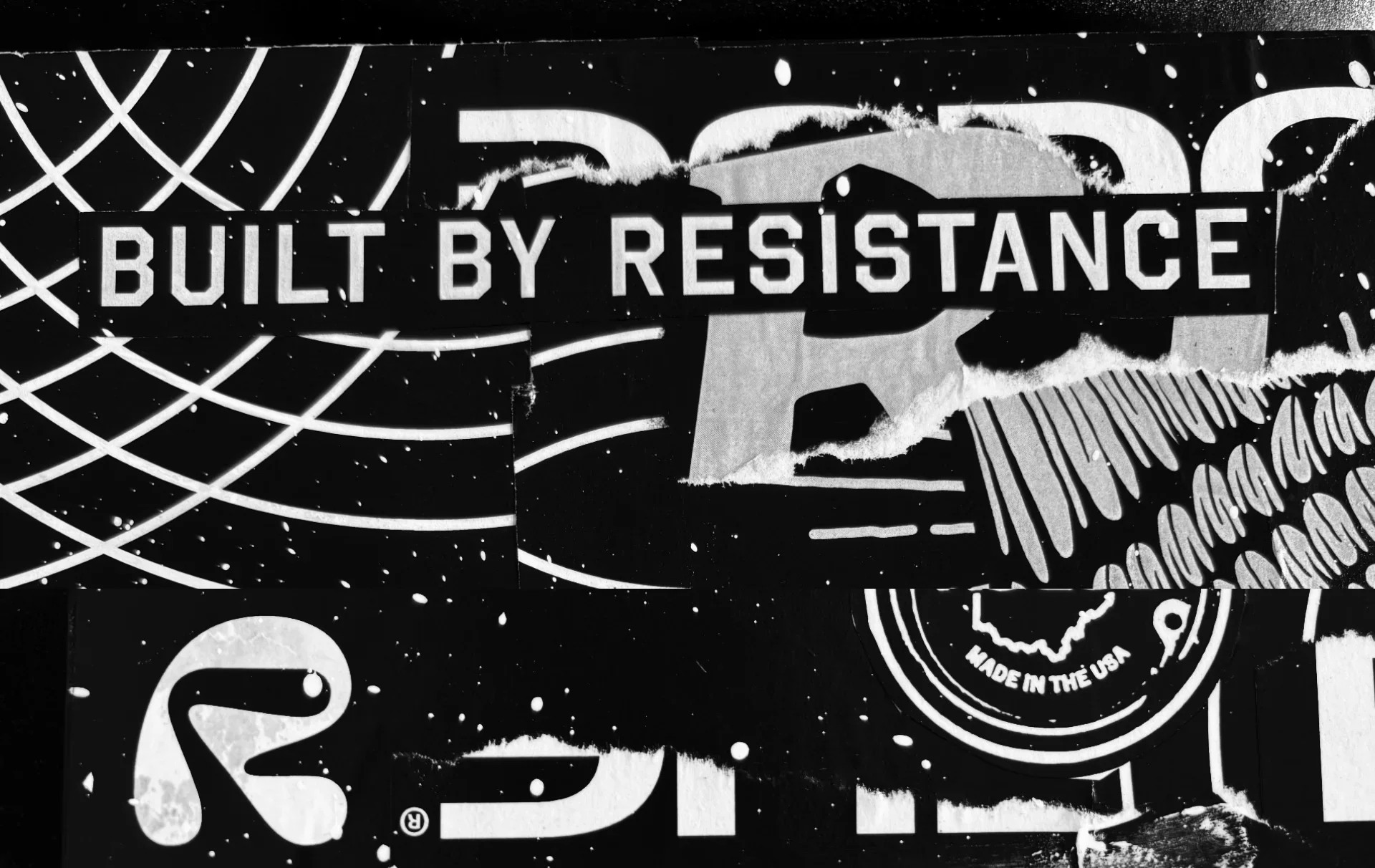
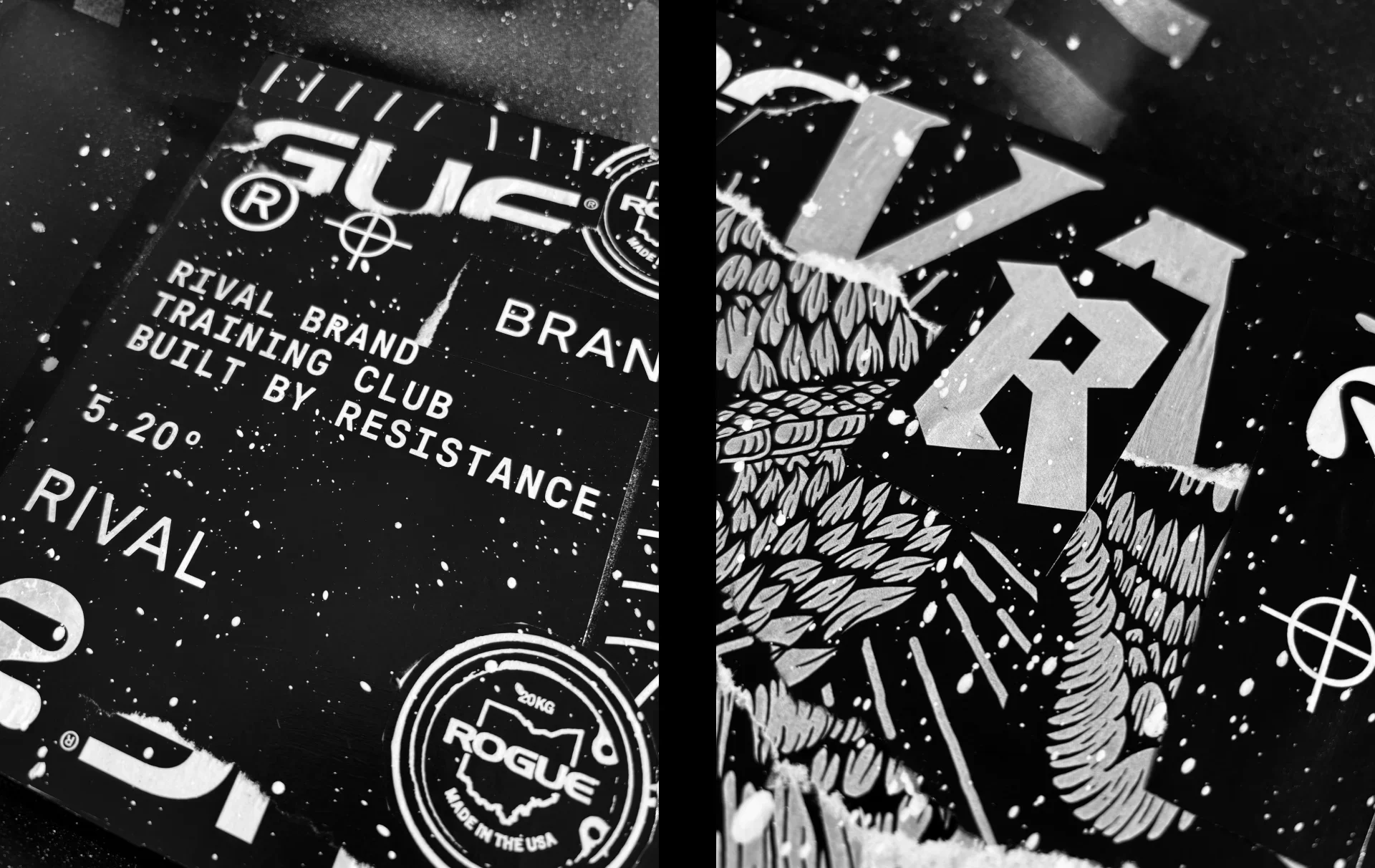
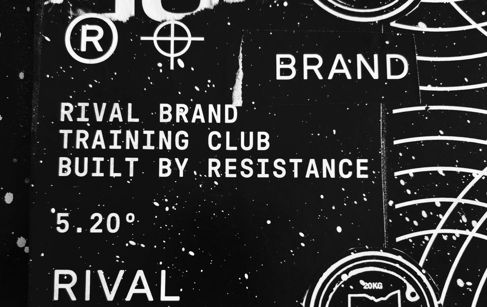
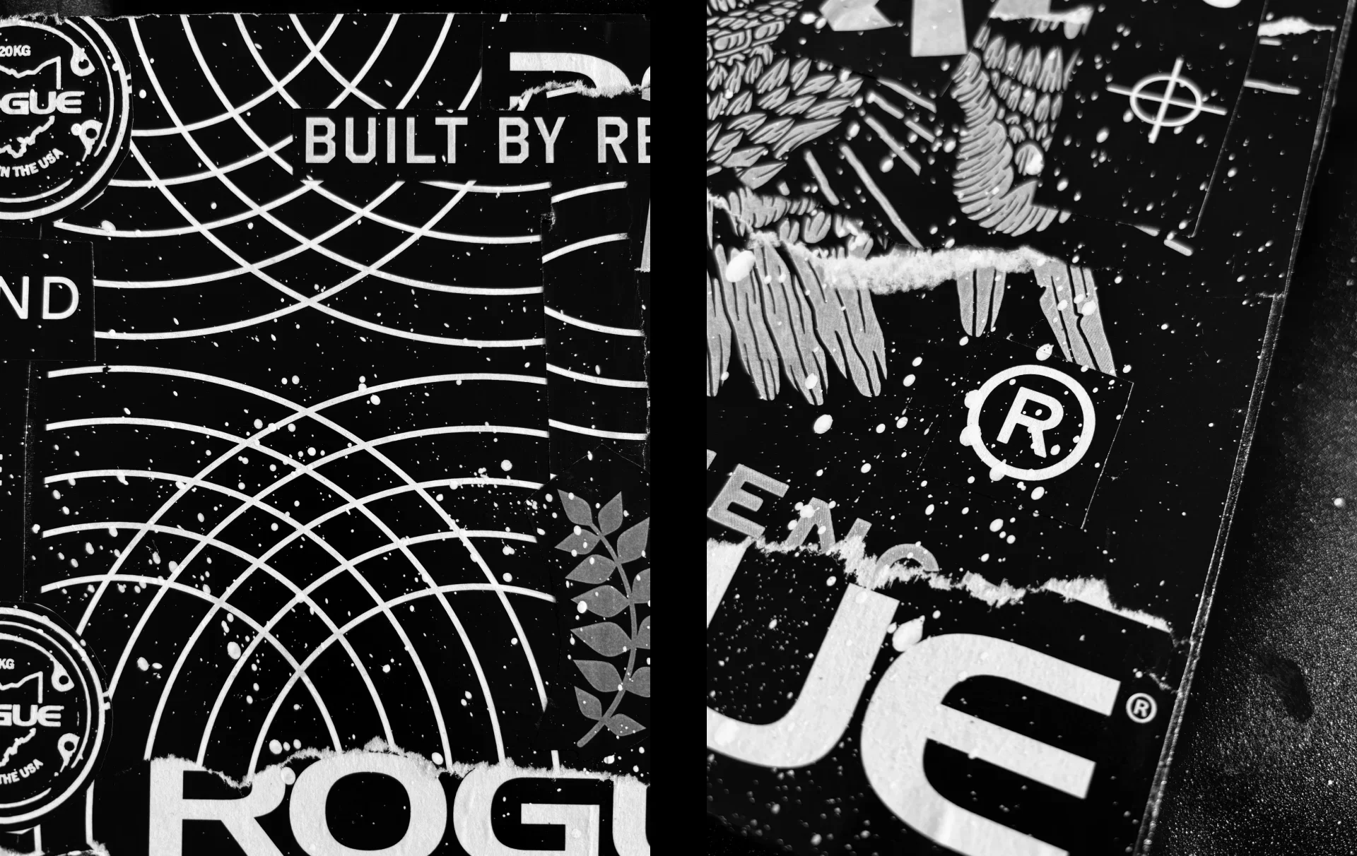
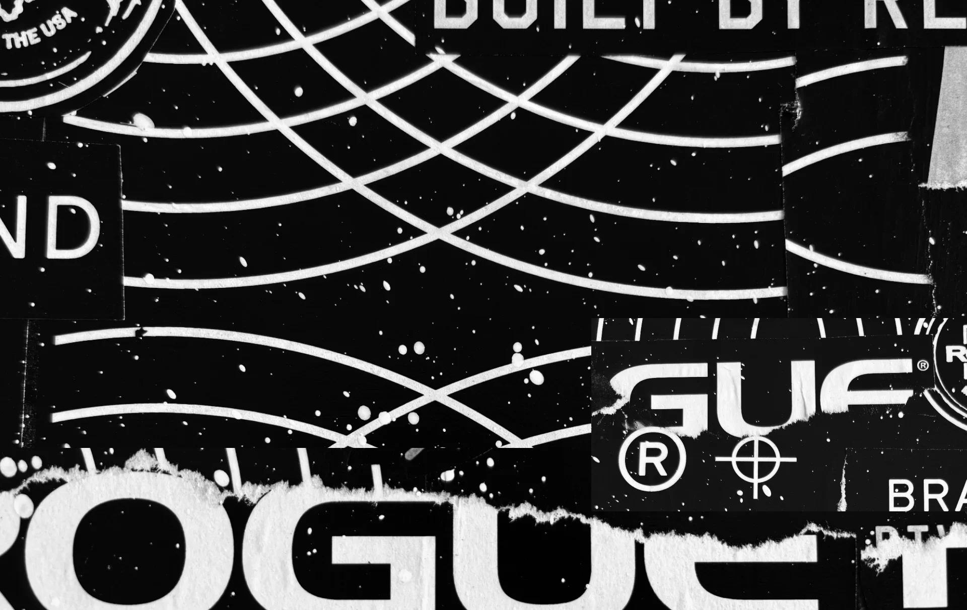
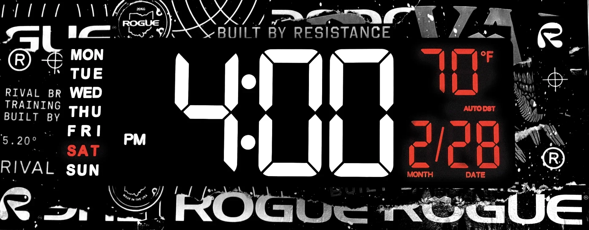
This project began as a practical need, a mounting board for a new clock, and evolved into a study in resourcefulness and brand identity in my home gym. Using scrap proofs from previous Rival Brand projects, I repurposed discarded print materials into a layered mixed media composition. What would have been waste became texture, color, and a story display.
Mounted to plywood as a structural base, the paper fragments were arranged intentionally, creating depth through overlapping typography, cropped logos, and partial marks from past projects. The digital clock sits at the center, contrasting precision and function against the raw, tactile surface of analog materials. The result bridges time in more ways than one, physically displaying it while visually referencing Rival brand’s ethos.
This piece operates as both utility and creative expression. It demonstrates how branded resources can extend beyond their original purpose, reinforcing identity through reinvention. By transforming production scraps into a functional installation, the project reflects a mindset rooted in sustainability, problem solving, and an ongoing dialogue with the Rival Brand visual language.
CATEGORIES:
Personal, Rival Brand, Branding, Creative Direction, Stickers, Home Gym, Mixed Media